The Perfect Color Palette for a Fake Dating Romance Book Cover
Some romance tropes are timeless, and fake dating is one of them. There’s something about two people pretending to be in love, only to fall head over heels for real, that keeps readers coming back for more. Maybe it’s the tension. Maybe it’s the inevitable moment when one of them whispers, What if we didn’t have to pretend? Whatever it is, this trope deserves an aesthetic that captures its magic.
A well-chosen color palette can do just that! Whether you’re designing a book cover, marketing graphics, or social media posts, the right colors help set the mood. Let’s dive into a palette designed specifically for fake dating romances—one that blends playfulness, passion, and emotional depth.
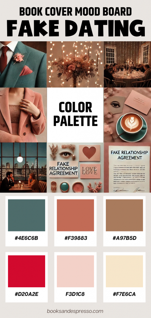
🎨 Meet the “Accidental Love” Color Palette
Each shade in this palette reflects a key emotion in a fake dating story. Together, they bring the romance to life.
🌸 Blush Pink (#FFB6C1) – Flirty Beginnings
A soft pink like this sets the stage for playful moments and undeniable chemistry. It’s the color of shy smiles, stolen glances, and that first unexpected spark. Fake or not, something is definitely happening here.
❤️ Cherry Red (#D2042D) – Passion & Tension
Tension builds. Fake kisses start feeling real. The push and pull between pretending and actually falling in love? That’s where cherry red shines. This is the color of longing, heart-racing moments, and that one kiss that changes everything.
✨ Champagne Gold (#F7E7CE) – Glamorous Dates & Pretend Luxury
Every fake dating romance has that one fancy event—a gala, a wedding, or a red-carpet moment. Champagne gold adds elegance, making everything feel a little too real. Under twinkling lights, pretense blurs into possibility.
🌊 Teal Blue (#008080) – Emotional Depth
Beyond the charade, emotions run deep. Teal represents those quiet confessions, deep conversations, and stolen moments that feel far too natural. Pretend relationships aren’t supposed to have real feelings—so why do they?
💜 Soft Lavender (#C8A2C8) – Romantic Daydreams
The ‘what if’ moments begin. Soft lavender captures the daydreams, the growing hope, and the subtle shift from fake to real. This is the color of hesitation, possibility, and hearts that refuse to listen to logic.
☕ Warm Beige (#F5DEB3) – Comfort & Friendship
Before the romance, there’s friendship. Before the love, there’s trust. Warm beige embodies the cozy moments—late-night talks, morning coffees, and the feeling of home that sneaks in when they least expect it.
🖌️ Bringing This Palette to Life
Looking for ways to use this palette in your book aesthetic? Here are some creative ideas:
📖 Book Cover Design
Mix blush pink and cherry red for a fun, eye-catching romance cover. Add a touch of champagne gold to hint at the glitz and glamour of high-stakes fake dating.
📱 Social Media Graphics
Use soft lavender and teal blue to create dreamy Instagram posts or teaser quotes. Want to highlight the tension? Pair red and beige for a mix of warmth and passion.
📔 Self-Published Book Interiors
Accent your chapter headers with champagne gold for a polished feel, or use beige backgrounds for section dividers to create a cozy, elegant aesthetic.
🎬 Pinterest & Instagram Moodboards
Combine all six colors in a Pinterest board or Instagram carousel featuring fake-dating-inspired imagery: elegant dresses, contract agreements, city skylines, and cozy coffee dates.
📷 Moodboard Inspiration
To truly capture the energy of this trope, I created a Fake Dating Romance Moodboard featuring:
✅ A stylish couple on a fake date, sneaking glances when no one’s looking
✅ A gala with golden fairy lights, setting the stage for romantic tension
✅ A contract with ‘Fake Relationship Agreement’ written across it
✅ Hands almost touching, but hesitating at the last moment
✅ A cozy coffee shop scene where they laugh a little too easily
✅ A city skyline at night, representing whispered confessions and stolen moments
(Insert moodboard image here—upload to WordPress media library and place it in this section!)
💖 Why This Palette Works for Fake Dating Romances
Fake dating stories balance tension and sweetness, and this palette reflects that perfectly.
💕 Blush pink and cherry red capture the mix of flirty fun and undeniable attraction.
✨ Champagne gold and soft lavender add elegance, fantasy, and just the right amount of dreamy romance.
🌊 Teal blue and warm beige ground the story, highlighting the depth of connection hiding beneath the act.
Whether you’re an author, designer, or romance lover, this color palette brings fake-dating-gone-real to life visually.
📢 Let’s Talk Romance Aesthetics!
Do these colors remind you of your favorite fake dating romance novel? Have you seen book covers that fit this aesthetic?
✨ Drop your thoughts in the comments! Which fake dating books do you love?
📌 Save this post for later & share with fellow romance lovers!
📌 Bonus Tip for Authors & Designers
If you’re designing book covers or promo materials, tools like Canva, Photoshop, or Procreate can help you create custom overlays and stunning graphics. Try blending gradients, layering colors, or using soft pastels with bold contrast to match your book’s tone.
Ready to Give Your Fake Dating Romance a Signature Look?
The perfect romance deserves the perfect aesthetic. Use this palette to bring your book to life, and let the magic of fake dating unfold—one color at a time.